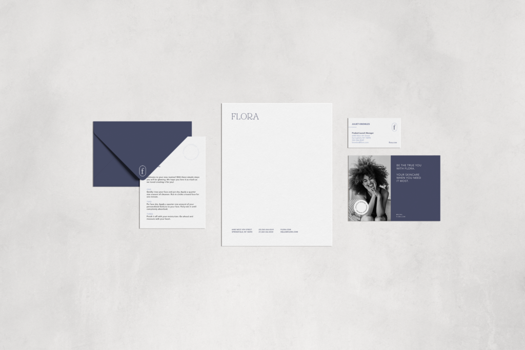
Branding
Brand Guidelines
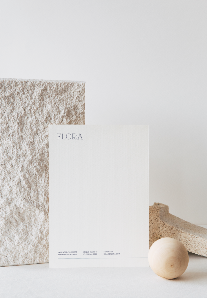
Letterhead
Business Card Design
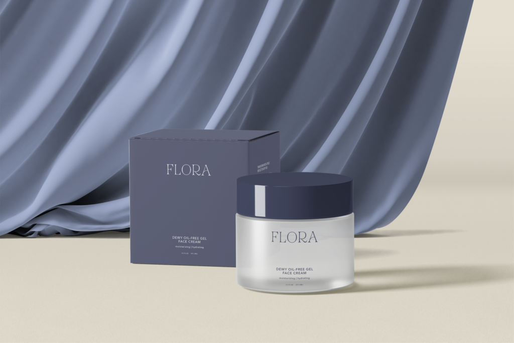
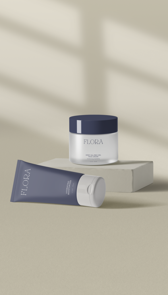
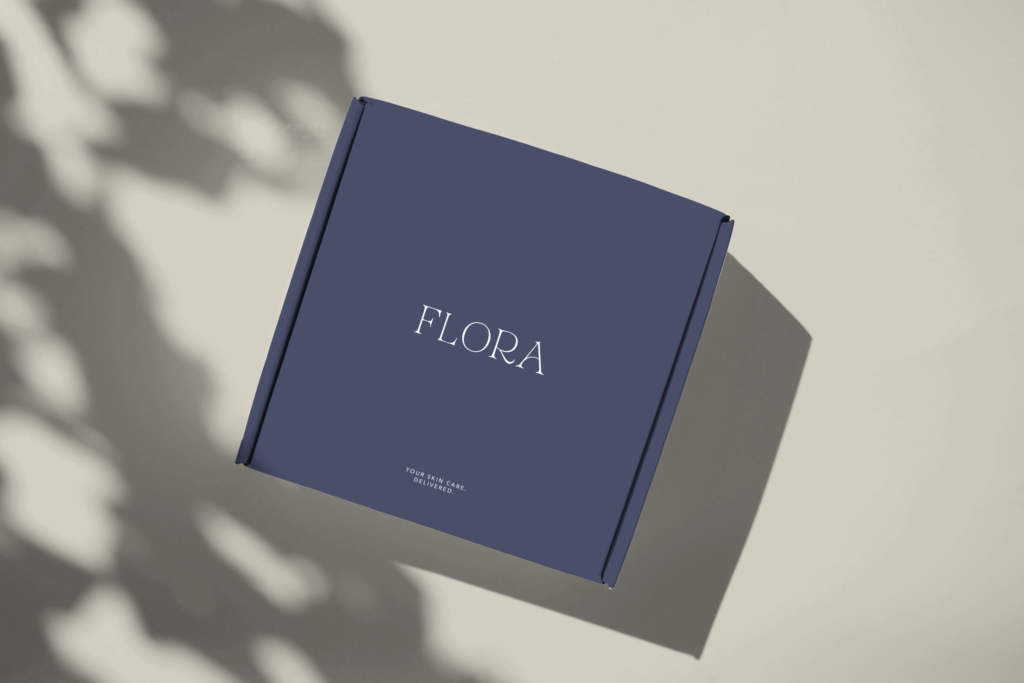
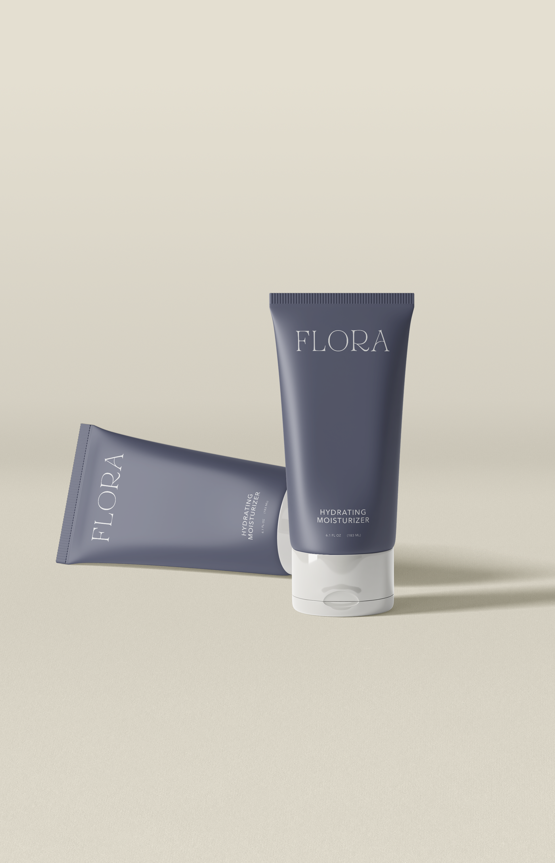
Packaging
The primary logo uses a refined serif typography that hints at the realness and approachability of the brand.
Minimal secondary logos are reflective of the limited and clean skincare ingredients.
Purposefully crafted brand and web design.