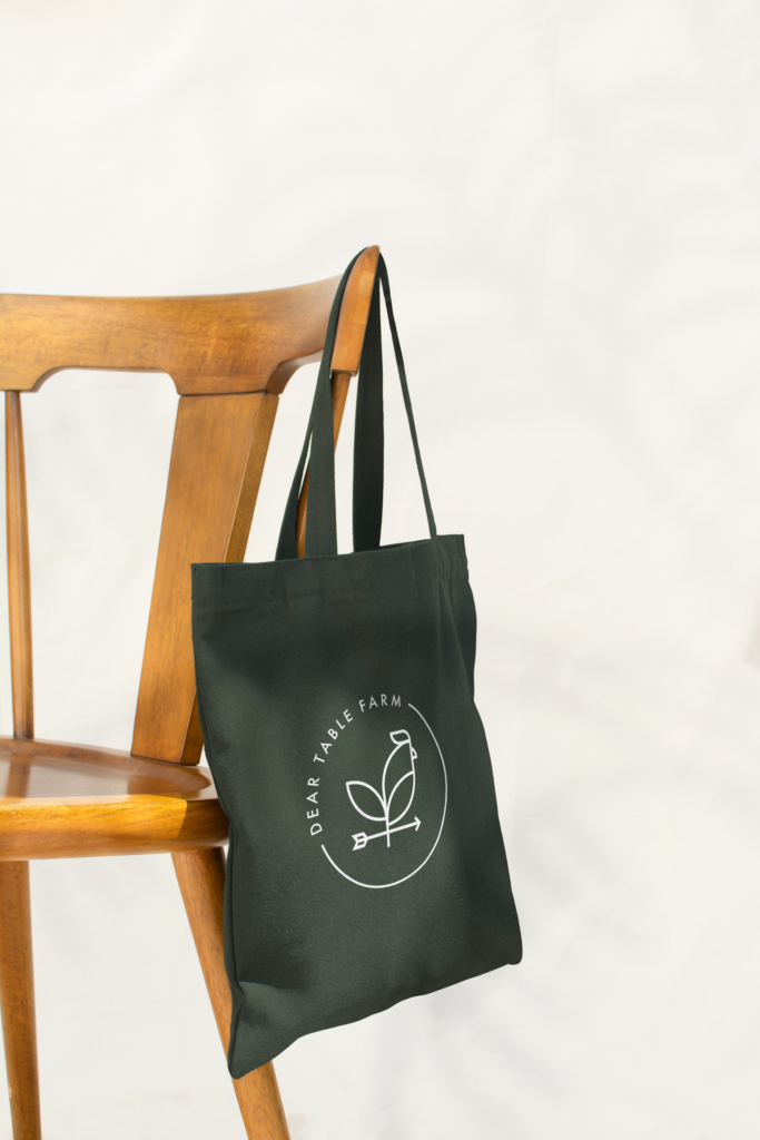
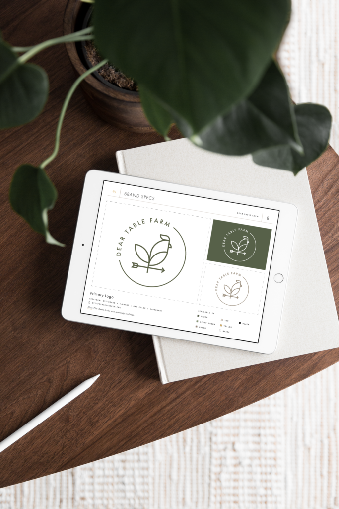
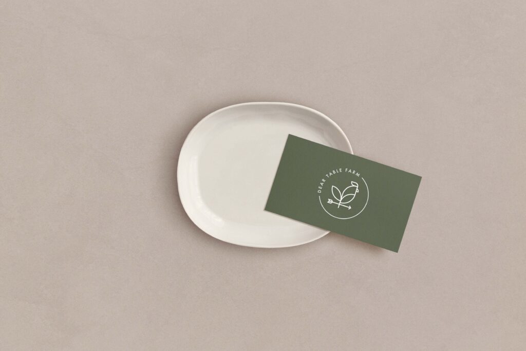
The Dear Table Farm brand is built around the concept of a plant and rooster weathervane, reflecting both the agricultural focus of the farm and the personal significance weathervanes hold for the founders. This unique symbol encapsulates the essence of the farm, highlighting its dedication to growing a variety of plants and vegetables.
To enhance the brand's personality and rustic charm, a secondary script font is paired with a sans serif typeface. This combination adds a touch of warmth and authenticity, perfectly aligning with the farm's values and aesthetic. The resulting design is a harmonious blend of tradition and modernity, capturing the spirit of Dear Table Farm in every detail.
“Corrine was very attentive to our needs, wants, dreams, vision + asks!!! She was patient with us throughout the process and was able to give us her professional opinion and direction.
We ended up with a logo + branding we love and are excited to be able to continue the relationship with her as our business grows. We just received our first batch of merch with the logo and LOVE it!!