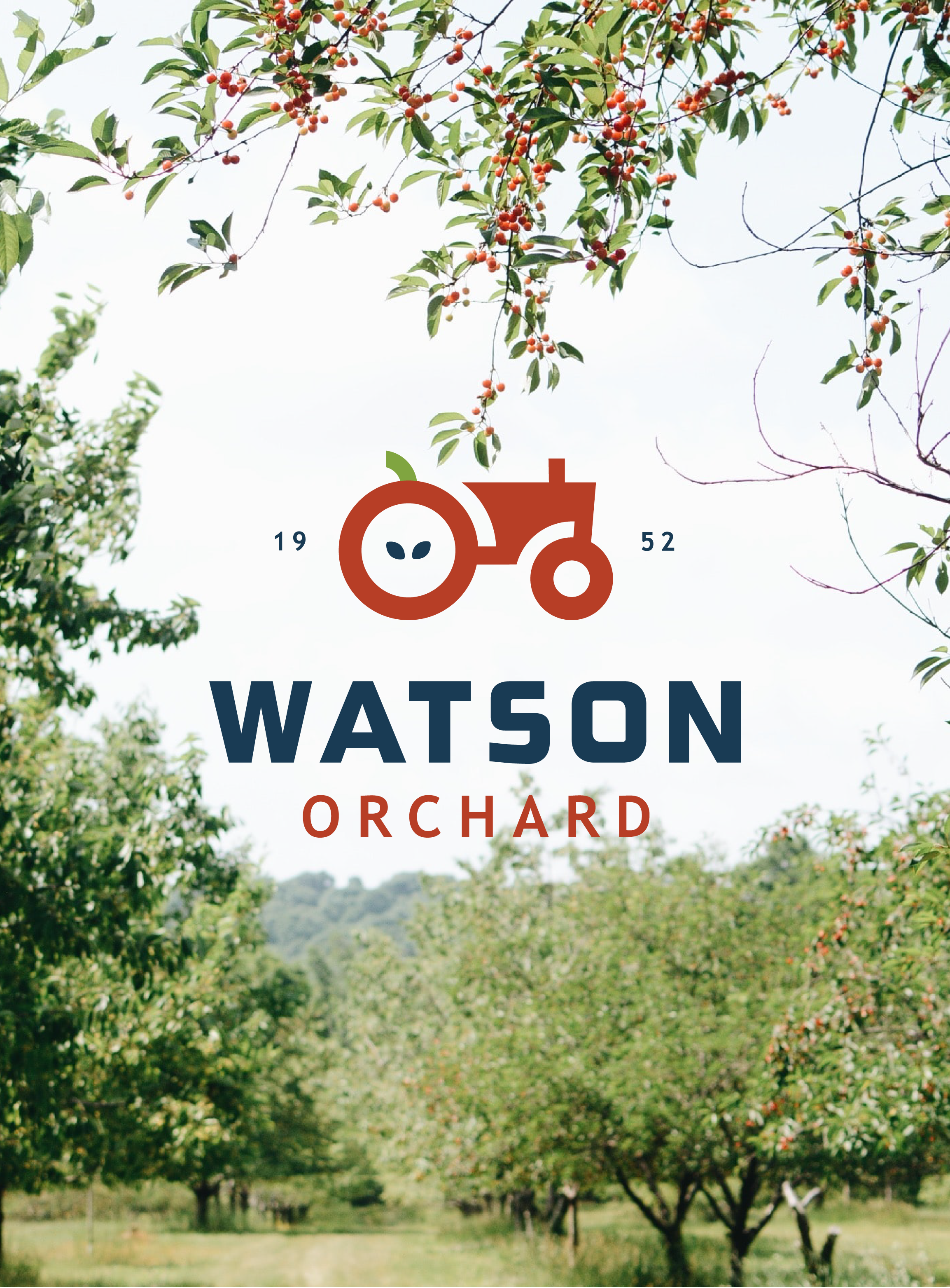
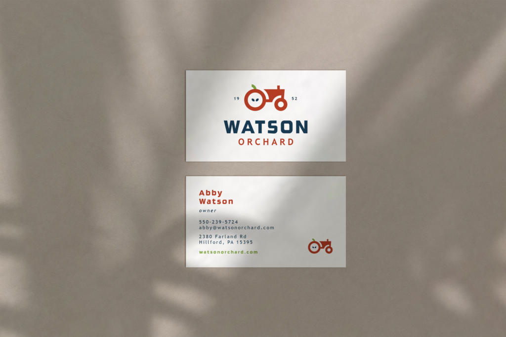
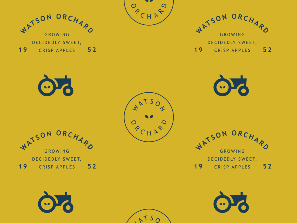
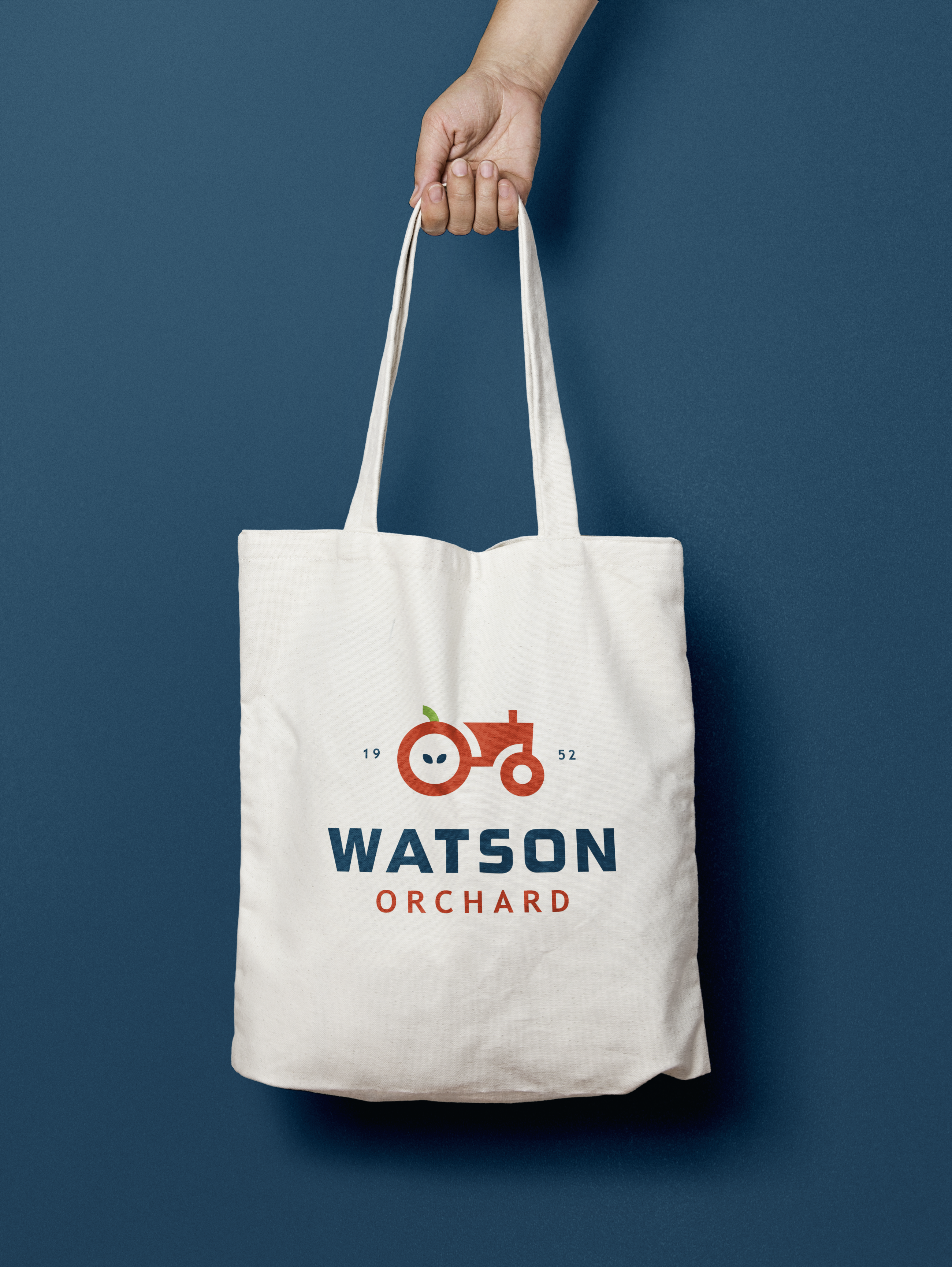
The color palette infuses the brand with life and color. The primary font lives in dark blue, and is complimented by an apple red. The light green, and yellow are reserved for moments where a pop of color is desired. The addition of the apple seeds in the tractor tire, and the stem as the seat, tie the primary logo together.